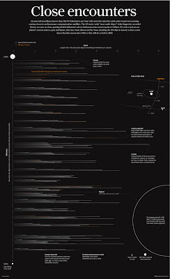
A 45-metre-wide asteroid came remarkably close to Earth on Friday, even closer than communication and weather satellites. It was be the nearest known close miss for an object of its size.
When this story was first mentioned in the newsroom, a few days before the incident, it sparked debate. People were intrigued as to how close these objects come to Earth. How many pass by? And how fast or large are they? A perfect opportunity for an interesting graphic.
As usual, NASA had every piece of information we needed. Their Near-Earth Object Program was established in 1998 to help coordinate, and provide a focal point for the study of comets and asteroids that can approach the Earth's orbit. They have data sets on all close approaches to Earth since 1900 and projected forward to 2200.
The main part of the graphic shows all close approaches passing the Earth at a distance of one Lunar Distance (LD) or less. In other words, passing closer to Earth than the Moon. All 199 historical and projected passes are shown. All are arranged on the vertical axis by the distance they came to Earth. The axis represents the distance from the Earth to the Moon. Both of which are represented at each end, drawn to scale. The Length of each bar represents the speed at which the asteroid was traveling. White objects have already passed and orange are forecast.
We also included two smaller diagrams. One showing 2012 DA14's orbit and how it will pass Earth and another showing its size compared to the Space Shuttle and the largest asteroid on the chart.
The chart below did not make it on to the graphic.
This shows all the asteroids over time. Every close approach recorded by NASA from the year 1900 to 2200 going out even further to 5 Lunar Distances or less. When we plotted it on this chart we noticed a strong trend. The last decade or so has seen a huge spike in the number of close approaches. Or has it? We figured this chart was too good to be true and assumed it may have something to do with recent technology and a greater ability to track these objects now. After speaking to NASA our suspicions were confirmed. It is harder to back track and accurately plot every close approach earlier in the 20th century and hard to predict as many in the distant future. After learning this we decided the chart was slightly misleading and decided to drop it.
We decided the information we were showing was strong and simple enough to hold a full page and ran the graphic in Friday's newspaper as a back page.


No comments:
Post a Comment