Roadside pollution in Hong Kong hit a record high this year,
on August 2 in Central, with the index reaching 212. As the year drew to a
close, we took a look at how the air had fared in every hour in the year up to
the publishing date.
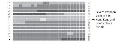
Each day is represented by a row of 24 squares, one for each
hour of the day. The shade of the square indicates the pollution reading at Central monitoring
station.
The idea was to give the reader an overall glance at the
year so they can see the worst and clearer periods, but also the opportunity to
dig a little deeper into the hourly data. We also added some text pointers to
explain some probable contributing factors to clearer air such as typhoons.
Hong Kong’s air pollution is often blamed on its proximity
to mainland China’s industry. Wind direction each day is included as small
arrows to the left of each row in order to gauge, if any, the relationship between northerly winds and
bad air.
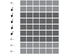
We wanted the reader to come to their own conclusion about
the relationship with wind direction but it turns out a lot of the bad spells
coincide with winds from the North (black arrows). See below.
The graphic was published as a full broadsheet back page
near the end of December.


No comments:
Post a Comment