Thursday, December 13, 2012

Messi v Muller

We published this information graphic when Lionel Messi broke Gerhard Muller's record of 85 goals in a calendar year. 


The chart shows every goal, plotted by date scored. The length of a bar represents the number of goals scored in that day’s match. 


We wanted to do more than simply compare the number of goals each player has scored. Presenting every goal on a timeline in this way allows us to study the data and draw our own conclusions as to which of the two goalscorer's records in most impressive. It lets us see busy scoring periods, drier seasons, big hauls in some games (often scoring 4 or 5 goals) and most importantly, how Muller continued his prolific scoring rate for many years after he set the record in 1972.


The data for Messi's goals and when he scored them was pretty easy to find from various reliable websites. Muller's was not so easy. So much so we had to commission a private sports data company in Germany to compile it for us. In the end we decided it was worth the extra expense in order to show the information this way and give the reader a different angle to other Messi infographics they may have seen recently.

Sunday, December 2, 2012

As the government considers a revamp of electricity tariffs, we took a look at Hong Kong's power consumption. Who uses all the electricity in our city and what is it used on? This graphic was printed last week as a full broadsheet back page. Data set was provided by the government's Electrical and Mechanical Services Department.


This type of chart is known as a Sankey diagram. The thickness of each line reflects a value. In this case, an amount of electricity in terajoules. All of the lines add up to give subtotals and totals by users (grey) and end use (coloured).


Friday, November 23, 2012

Wages in Hong Kong

As Hong Kong’s wealth gap widens, who is on which side of the growing divide? This graphic shows which industries pay the most and which have the biggest discrepancies between their highest and lowest earners. The dataset was provided by the Hong Kong Census and Statistics Department and covers all official employment in HK. This graphic was printed as a full broadsheet page.


Each industry is represented by a series of 3 connected dots. The middle dot is the median wage for that sector and the top and bottom dots are the averages for high and low earners (90th and 10th percentile). This shows some industries have a huge difference between top earners and what most others are paid.


The height of the dots reflects the hourly wage in HK$. The industry, or green line/dots, is also placed left to right along the x axis according to how many people work in that industry. You can see Import and Export Trade alone out to the right of the chart. By far the biggest employment sector in Hong Kong.


Restaurants and estate services had the lowest two averages.


Sunday, September 30, 2012

Combining hand drawn illustration with vector


This piece from a few months ago shows a slightly different approach to our graphics. We don't often get to combine soft hand drawn illustrations with vector drawings. But sometimes, instead of the two styles fighting for attention in the graphic they can compliment each other well.


This graphic was created to accompany a story covering the first implantation of a subretinal microchip in Asia. Mrs TSANG WU Suet-yun had been legally blind for 15 years. The operation at the Eye Institute of The University of Hong Kong restored her sight in one eye.

In this case we used a black and white pencil style of sketching by senior graphic artist and Illustrator Adolfo Arranz. Then the graphic was put together and vector illustrations finished by myself in Adobe Illustrator. 

Using the softer hand drawn illustrations for the face and skull allowed the major highlights like the eye and the technology to stand out more and be the main focus. The drawings served their purpose of locating the device around the skull and eye socket but also gave it a more human touch as the face drawn is an actual portrait of the lady who received the operation.

First we found good visual reference for the skull. Facing a good angle so we can show all the elements in the right eye and the eye socket and also the battery near the ear. Then drew the sections of the skull needed on one file and the portrait of Mrs Tsang at the same angle on another file. Overlaid the two and erased the parts not needed. Then we included the illustrator drawings of the eye and the device and then layered them accordingly. A few more smaller diagrams were added to explain the device and disease.


Mrs Tsang


Portrait

Skull/eye socket


Eye and device


The story was a breaking news piece so we finished and published the graphic in around 5-6 hours.


The page


Saturday, September 22, 2012

NatGeo infographics from 30 years ago

I was trying to keep this blog mostly about my work of my own and from our department but came across something I thought I should share. 

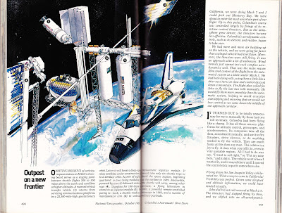
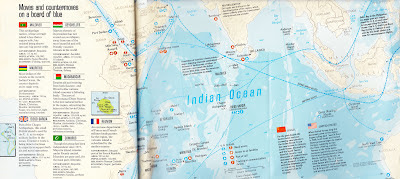
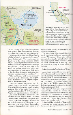
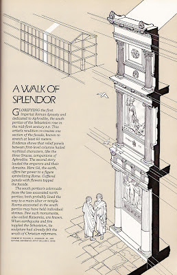
For my birthday last year my very thoughtful wife managed to get me this original copy of  National Geographic from the month I was born. October 1981. Like most people in my line of work, I love National Geographic for many reasons including the very high standard of information graphics and cartography. So, naturally, I got stuck in to see what their graphics were like back then. So here are some examples. I included some illustration too which all seemed to tie together with the graphics to create a uniform style.


The cover story also turned out to be very interesting. It covered STS-1, the first orbital flight of NASA's Space Shuttle program and also the future of the Space Station. That was also a coincidence and quite special to me as last year, and almost exactly 30 years later, I was working on one of my first major graphics for the SCMP. The final Space Shuttle mission drawing the entire program to a close. Shown in an earlier post.


Nice illustration


Graphic showing main parts and basic maneuvers


The planned Space station. Long before ISS


Kennedy Space Centre


The two illustrations above also serve as an infographic with numbered pointers explaining what the various parts are.


Next up, a few maps. The cartography was still of a very high standard 30 years ago. From three page fold outs to single column locator maps.


Fold out map of US and USSR naval presence in the Indian Ocean


Mono lake in California.


Single column migration route map


Everest's Northern Ridge


And finally another hand drawn graphic about restoration of a Roman facade.


That's it... Hope you enjoyed them.


Monday, September 17, 2012

Euro 2012 football graphics

Here are a couple of examples of graphics we created during the Euro 2012 football (soccer) championships. We published a preview supplement which contained some smaller graphics on individual team performance during qualifying and venue maps etc. 

I then created this graphic below as a stand alone feature in sport just before the tournament kicked off. It shows all of the goals scored during the qualifying rounds and where they were scored from. The red lines also highlight the top scorer's goals for that particular team.

For the data we worked with Opta, a UK based sports data service. They can help with almost any request for sports data and also have a subscription service if you're serious about sports graphics.


Portugal and Ronaldo detail showing all those long range goals 


This second graphic was printed before the final between Spain and Italy. A lot of press had been given to Spain's brilliant passing game. And Pirlo was also playing well and pulling the strings for Italy. After speaking to sport we decided this was a good place to start and worked on a review of all the passing, defending and attacking from the two teams so far in the finals.

For this we used a Euro2012 ipad app no longer available which was also powered by Opta. There are lots of free or reasonably priced apps available rich in sports data and often powered by great sources. This particular one even had pass tracking features so we were able to get every pass, screen shot it at high resolution and then trace them. Though it did take a long time for us to trace 6,000 passes!


On the spread


Xavi detail


Wednesday, September 12, 2012

Our Titanic work


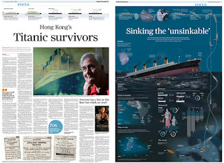
Most publications would have done some sort of graphics looking back to what happened to the Titanic 100 years ago. We decided to do two separate graphics. The first looking at the ship itself, which at the time was an engineering marvel. The second, published a day later on the anniversary itself, looked at the tragic events of the sinking. For both we negotiated a large amount of space at a full broadsheet page each.

The first graphic was done by myself. Obviously I started by researching. We knew this was coming up way ahead of time so could start researching early. The main source I used for the graphic was a special edition Haynes manual I ordered over the Internet. It was 150 pages of diagrams, photos and text covering every working part of the ship. I used this as the base for my deck plans and worked from there.


Haynes manuals have been made since the 1960s for almost every popular model of car. They are aimed at owners and professional garage mechanics, helping them to strip down and rebuild cars. This was a special edition launched for the 100th anniversary of the titanic.


Inside


Deck plans


After researching I started to plan out the graphic. I traced out the flat deck plans and used the Extrude & Bevel tool in Illustrator to try them at different angles to see which gave the best view to see every room. I then illustrated the whole ship at the same angle, dissected it into the correct slices and sunk in the floor plans which I'd drawn up in 3D. All as vector in Illustrator.

Later in the graphic I realised there was some updating to be done. Although the deck plans in the manual were attributed to the shipbuilder themselves, there were a few details which didn't match some other plans I'd seen elsewhere. After getting in touch with the publisher I found out the plans in the book were for the Olympic class of cruise liner in general. There were three ships built in this class and Titanic was one of them, but she also had a lot of individual modifications being the flagship liner.

The Discovery Channel also had some very detailed blueprints of the ship which I used to cross check. One obvious difference was the promenade and millionaires' suites on B deck. See below. The Haynes version on top shows an open promenade when the Titanic actually had this section turned into private promenades as part of the two millionaires' suites.


And in the graphic...


After checking the rest of the plans a few more alterations were made. Then labels and other parts of the graphic were added. 


End result


I worked on this graphic for months in between other projects and daily work. It was published on Saturday's back page. The day before the 100th anniversary.


PART 2

The following day came the second graphic which looked at the disaster itself. This graphic, by Adolfo Arranz, had a completely different style. A more tragic feel, illustrated at night, and drawn mostly using Coral Painter in Adolfo's usual technique. Some Adobe Illustrator parts too.


The spread


This graphic ran on a spread inside the paper with a feature story on survivors.


Sunday, September 9, 2012


Local issues - Public identity

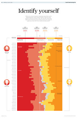
In the last couple of posts I've shown graphics covering big international stories. In contrast, here is a recent graphic we created which looks at a local issue. This was part of our coverage of Hong Kong's 15th anniversary of the handover from Britain back to China. In the last 15 years  a local university has been keeping a running survey on how people would identify themselves. Either as a Honk Kong citizen or a Chinese citizen or somewhere in between. This has swung back and forth over the years for a number of possible reasons. We created this graphic to show the results over time.


We stuck with a similar solution for the interactive version. We created this one for the site so it could stay up longer and let people explore the data for themselves. This one generated the largest number of clicks to date on the paper's Facebook page. 


Interactive version can be viewed here


Wednesday, September 5, 2012

Malofiej 20


A look at our participation at Malofiej 20 infographic world summit and awards in Pamplona, Spain. I'm sure most of you have already read everything there is to know about the conference itself and the success of publications such as the New York Times and National Geographic this year. Here is a quick look at what we sent and what we won medals for in the Post's first ever entry to the competition.


This was a silver medal in the features category. This was a graphic by myself, again on the back page of news, to coincide with the withdrawal of US troops from Iraq. The main chart shows the number of civilians who lost their lives as a result of the conflict on a monthly basis. These are compared to coalition fatalities (darker red, inset bars).


Bronze in features category. This was our first full-page graphic we negotiated for the back page. The graphic ran with a feature on the space shuttle's last mission back in July 2011.

Below are some more examples which contributed to a bronze medal in the portfolio category.


A cartogram showing the population of each country in 1950 compared to 2011. Section in the bottom left of the graphic shows how much space a crowd of seven billion would take.


Two more graphics showing the Human and financial costs of conflict since 9/11 and a chart showing 2011's most reported stories by daily word count.

Malofiej was a great experience and we look forward to seeing any of you there again next year.

http://www.malofiej20.com/  Malofiej official site
http://www.malofiej20.com/wp-content/uploads/2012/04/M20_Awards_Premios_OK1.pdf   Winners list


Monday, September 3, 2012

First post

Olympics


Hello and welcome to my new blog about information graphics. I will mostly post examples of my own work and some other pieces from our graphics department at the South China Morning Post (SCMP) where I'm currently Graphics Director. 

I thought a good place to start would be to show some of our work for the London Olympics. Here are some examples of ways print graphics were used during our coverage.


During the two weeks running up to the Games we started to run a few slightly off-beat, feature graphics. These were a full broadsheet page each and appeared on the back page of the main news section. This is a spot we've been using regularly to do large stand-alone feature graphics. I'll talk more about our back page infographics in general in another post soon.


The ancient games. 

This graphic (above) by senior infographic artist and illustrator Adolfo Arranz shows one approach we often take. In this case the subject was better suited to a hand-illustrated style of drawing. This graphic shows some of the old events from the ancient Olympics, the venue Olympia and some of the history behind it. This sets the scene and was used as an opener for our coverage.


Evolution of sports

This back page, by myself, shows the history of all sports, number of events in each sport and how they have evolved over time. It also highlights the stranger, short-lived events and retired sports.


Gold medals
And another example by myself shows overall gold medals and which countries dominate each sport and by how much.

Throughout the Games there were also a number of breaking stories and features which required graphics on a daily basis.