Sunday, January 10, 2016
New blog location
I've moved my blog over to my new site here http://www.simonscarr.com/blog/ and have added a couple of posts looking back at some examples from 2015. Do head over and take a look.
Sunday, November 23, 2014
Online graphics
The department has also had a busy year building online graphics, ranging from HTML packages combining static graphics with narrative to more code intensive interactives.
Below are a few examples the Reuters Graphics team has put together.


China's corporate debt
Chinese company debt hit record levels earlier this year and looked likely to accelerate a wave of domestic restructuring and trigger more defaults, as credit repayment problems arose. Our interactive analysed the landscape of company debt in China, showing the extent of the problem. The graphic also allowed a detailed look at each sector as well as information on individual companies.


Gaza damage
This piece took a closer look at UNOSAT data and satellite imagery which was released during the crisis in Gaza earlier this year.

U.S. border crisis
The U.S. has been facing a surge of unaccompanied children arriving from violence-torn El Salvador, Guatemala and Honduras. This package of graphics accompanied the ongoing story.


The Fed's balancing act
This interactive compares Janet Yellen's first day with past Fed Chairmen and shows how they managed the dual mandate of low inflation and low unemployment. For a detailed write-up on the making of this graphic read this article.


Below are a few examples the Reuters Graphics team has put together.
Australia wine
This page looks at Australia's vineyards and the affects of climate change. More wineries are choosing to move to the cooler climate of Tasmania.China's corporate debt
Chinese company debt hit record levels earlier this year and looked likely to accelerate a wave of domestic restructuring and trigger more defaults, as credit repayment problems arose. Our interactive analysed the landscape of company debt in China, showing the extent of the problem. The graphic also allowed a detailed look at each sector as well as information on individual companies.
Gaza damage
This piece took a closer look at UNOSAT data and satellite imagery which was released during the crisis in Gaza earlier this year.
U.S. border crisis
The U.S. has been facing a surge of unaccompanied children arriving from violence-torn El Salvador, Guatemala and Honduras. This package of graphics accompanied the ongoing story.
The Fed's balancing act
This interactive compares Janet Yellen's first day with past Fed Chairmen and shows how they managed the dual mandate of low inflation and low unemployment. For a detailed write-up on the making of this graphic read this article.
Special reports
Graphics also feature prominently in Reuters Special Reports which investigate the people, trends and issues that are defining the news. Driven by deep, proprietary reporting, Reuters Special Reports uncover new facts and shed new analytical light on topics of international interest.
These stories appear on multiple platforms but they also appear in a variety of formats. The articles are moved and displayed in the same way as regular stories but with two additional formats:
Microsites
If there are a number of Special Reports on the same subject that make an ongoing series then a microsite is often used to give readers greater access. These microsites are rich in multimedia including both static and interactive graphics. Some of these sites can be accessed here through our Reuters Investigates page.This piece below, titled "Water's Edge", is a Reuters analysis that finds flooding is increasing along much of the U.S. coastline, forcing many communities into costly, controversial struggles with rising sea levels. The report is based on a Reuters analysis of NOAA tide gauge data.


Here are some other examples:


PDFs
The articles are also laid out in well designed PDFs.
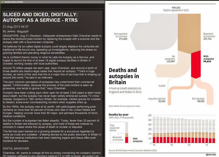
This Fukushima special report shown below revealed that contractors are hiring homeless men to work at Fukushima and shortchanging them on wages amid scant regulatory oversight of the most ambitious radiation clean-up ever attempted. This exclusive Reuters investigation detailed how Japan finds people willing to accept minimum wage to work on the $35 billion, taxpayer-funded effort to clean up radioactive fallout.
The network diagram below was key to explaining the way contracts are broken down through many layers of subcontractors. This shows the contract structure in Naraha town.
A year at Reuters
It's been well over a year since my last post so I thought it was time for an update. As you may already know I am now Deputy Head of Graphics at ThomsonReuters. I'm based with the graphics team in Singapore, but also working closely with graphics desks in New York and London. In this role, I will focus on strengthening and growing Reuters’ global graphics service to media and financial clients. While I’ll be responsible for managing and directing some of the graphics, I'm still finding the time to work on some projects myself.
Some examples
The department was kept as busy with internal mapping as it was publishing graphics. A lot of details such as distances to/from locations, directional headings, coordinates, navigational waypoints and remote islands were reported during unfolding developments. It was equally important for our own journalists and editors to understand this geography as it was the readers. We contributed to the reporting with a lot of geographical calculations and a lot of this work helped provide accurate detail and sometimes even shape stories.

This chart shows the extreme temperatures that caused play to be suspended in the Australian Open earlier this year.


Illustrated graphics

The graphic below accompanied a story on GM's ignition switch recall.

This simple but effective chart showed how Tiger Woods regained top spot as golf's no. 1...
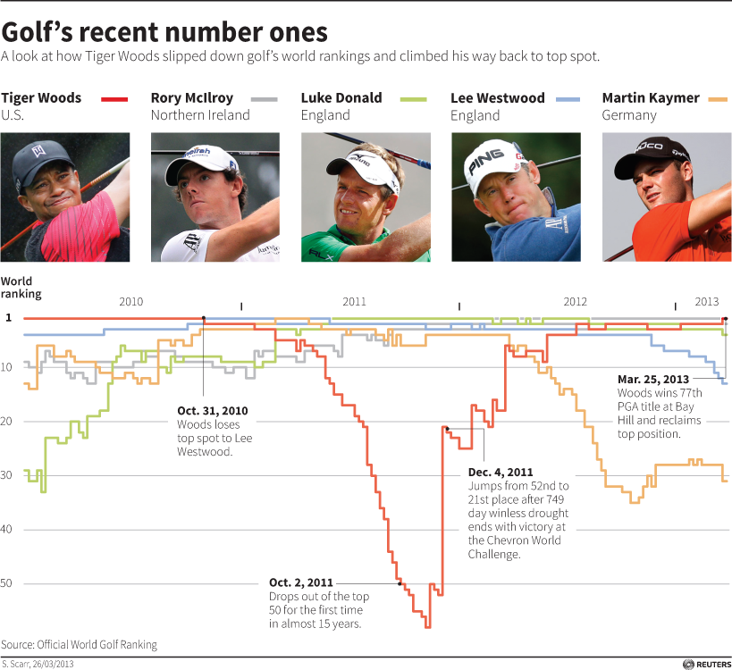
... and this is a similar interactive version we created afterwards.

We published the chart below when Gareth Bale broke the transfer record with a fee of 85 million pounds. We discovered that this was actually less than Ronaldo's fee in 2009 if adjusted for inflation.

On a lighter note, this feature graphic (below) documents Marvel Studios' expanding film franchise after the release of Guardians of the Galaxy. It includes lifetime box-office earnings and budgets of films based on Marvel superheroes, including those in the Marvel Cinematic Universe.

Expect some more posts on work from myself as well as work from the rest of the team at @reutersgraphics
(All opinions and statements are my own)
First I'll just give some background to the role graphics play here at ThomsonReuters. We publish to a number of different platforms and in a number of formats. Below are some examples.
Thomson Reuters Eikon
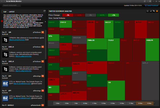
Information graphics are used to accompany stories on ThomsonReuters Eikon, a platform delivering a powerful mix of news, analytics and financial content to desktop and mobile. Eikon has built in charting functions which allow the reader to view and analyse data on thousands of companies, indexes, commodities, currencies and more. See the short videos on charting and interactive mapping via the link here. Custom information graphics are also displayed with stories published through the news section of the platform.


Media clients
Reuters News Graphics Service (RNGS) is a subscription or pay-per-use infographic service for news publications. Available in English, Spanish, French and Arabic, the service has been trusted and used by news publications around the world for many years.
RNGS transmits around 5 to 15 graphics per day. Our goal is to produce quality graphics that use reliable data and charting, accurate mapping, clear diagrams and illustrations to cover a range of topics including breaking news, financial and company news, sports, environment, science, features and advance packages for major events.
Below are a few examples of different types of graphics we create. At present, all files transmitted to media clients are static, editable eps files (interactives to come in another post).
Breaking news
MH370
Even though it was a year ago, I couldn't touch on breaking news and not mention the missing Malaysia Airlines flight. This interactive is the easiest way to see what graphics we created during the disaster. All of the elements in here were also published to media as static maps and graphics as the news broke.

Daily charts
Here are some examples of the kind of charts we create on a daily basis. The graphic below shows the size of China's' Yuan swap lines with central banks.
This chart shows the extreme temperatures that caused play to be suspended in the Australian Open earlier this year.
Here are some more charts from the department.
Illustrated graphics
This Fukushima graphic accompanied an in-depth analysis on how the spent fuel will be removed from reactor no. 4.
The graphic below accompanied a story on GM's ignition switch recall.
Sports
This simple but effective chart showed how Tiger Woods regained top spot as golf's no. 1...
... and this is a similar interactive version we created afterwards.
We published the chart below when Gareth Bale broke the transfer record with a fee of 85 million pounds. We discovered that this was actually less than Ronaldo's fee in 2009 if adjusted for inflation.
We also issued a number of graphics before, during and after major events such as the Tour de France, World Cup and the Olympics but I'll come back to those in a later post.
Features and analysis
Sometimes we can provide background or analysis to an ongoing story such as the Israeli-palestinian conflict as shown below. The chart shows every documented fatality as a result of the conflict.

Sometimes we can provide background or analysis to an ongoing story such as the Israeli-palestinian conflict as shown below. The chart shows every documented fatality as a result of the conflict.
Expect some more posts on work from myself as well as work from the rest of the team at @reutersgraphics
Friday, March 15, 2013
Gold medal at Malofiej
Here is a look at the graphic I created last year which just won a gold medal at Malofiej 21. I'll write a more detailed post explaining the thinking, process and research behind the graphic in the next day or so (after celebrating in Pamplona).
Congratulations to the team at SCMP with 5 awards in total, two of which went to Senior Infographic Artist Adolfo Arranz. More details to come soon.

Congratulations to the team at SCMP with 5 awards in total, two of which went to Senior Infographic Artist Adolfo Arranz. More details to come soon.

Saturday, February 16, 2013
Asteroids
A 45-metre-wide asteroid came remarkably close to Earth on Friday, even closer than communication and weather satellites. It was be the nearest known close miss for an object of its size.
When this story was first mentioned in the newsroom, a few days before the incident, it sparked debate. People were intrigued as to how close these objects come to Earth. How many pass by? And how fast or large are they? A perfect opportunity for an interesting graphic.
As usual, NASA had every piece of information we needed. Their Near-Earth Object Program was established in 1998 to help coordinate, and provide a focal point for the study of comets and asteroids that can approach the Earth's orbit. They have data sets on all close approaches to Earth since 1900 and projected forward to 2200.

The main part of the graphic shows all close approaches passing the Earth at a distance of one Lunar Distance (LD) or less. In other words, passing closer to Earth than the Moon. All 199 historical and projected passes are shown. All are arranged on the vertical axis by the distance they came to Earth. The axis represents the distance from the Earth to the Moon. Both of which are represented at each end, drawn to scale. The Length of each bar represents the speed at which the asteroid was traveling. White objects have already passed and orange are forecast.

We also included two smaller diagrams. One showing 2012 DA14's orbit and how it will pass Earth and another showing its size compared to the Space Shuttle and the largest asteroid on the chart.

The chart below did not make it on to the graphic.

This shows all the asteroids over time. Every close approach recorded by NASA from the year 1900 to 2200 going out even further to 5 Lunar Distances or less. When we plotted it on this chart we noticed a strong trend. The last decade or so has seen a huge spike in the number of close approaches. Or has it? We figured this chart was too good to be true and assumed it may have something to do with recent technology and a greater ability to track these objects now. After speaking to NASA our suspicions were confirmed. It is harder to back track and accurately plot every close approach earlier in the 20th century and hard to predict as many in the distant future. After learning this we decided the chart was slightly misleading and decided to drop it.
We decided the information we were showing was strong and simple enough to hold a full page and ran the graphic in Friday's newspaper as a back page.
Wednesday, January 30, 2013
Arteries of the city
I created this graphic back in October shortly after Hong Kong's Transport Department released their annual traffic census. The 182-page report was packed with statistics and useful information but the best data was a thorough breakdown of daily traffic on almost every stretch of road. The territory has hundreds of counting stations. We thought the chance to do something with these numbers was too good to miss so we pitched an analysis to the Editor who was keen to give it a good space.

The thickness of each line represents the average daily number of vehicles traveling on that stretch of road. The colour represents the percentage change on last year. This helps the reader to explore the data in two ways. You can clearly see that the main roads along the front of Hong Kong Island are still the busiest. But by the colour, the traffic has also mostly decreased compared to last year. You can also see that a lot of the roads in Kowloon have become busier. In particular the area up to the left, Tsuen Wan, the three tunnels north and the major highways to the east.
There is also a clear change in the cross-harbour tunnels. The Eastern and Western Harbour Tunnels have increased in traffic compared to the central tunnel which has decreased. But they still see less traffic.
The graphic is also a fun way for the reader to take a look around their neighbourhood or route to work.
Subscribe to:
Posts (Atom)